Typography is more than just a design element—it’s a powerful branding tool that subtly shapes how people perceive your business. The font choices you make can evoke emotion, build trust, communicate personality, and differentiate your brand in a crowded marketplace.
In this blog, we explore how typography impacts brand perception, the psychology behind fonts, and how to choose the right typeface for your brand.
Why Typography Matters in Branding
Typography is often the first impression of your brand. Whether it’s your logo, website header, or product packaging, the style of your type communicates meaning—even before a single word is read.
It influences:
- Brand personality (playful, serious, luxurious, modern)
- Readability and user experience
- Emotional connection
- Credibility and trust
Good typography isn’t just beautiful—it’s functional, strategic, and emotionally resonant.
The Psychology of Fonts
Different font styles trigger different psychological responses. Here’s a quick breakdown:
1. Serif Fonts (e.g., Times New Roman, Garamond)
- Impression: Traditional, reliable, authoritative
- Used by: Law firms, academic institutions, luxury brands
2. Sans-Serif Fonts (e.g., Helvetica, Open Sans)
- Impression: Modern, clean, accessible
- Used by: Tech companies, startups, lifestyle brands
3. Script Fonts (e.g., Pacifico, Great Vibes)
- Impression: Elegant, creative, personal
- Used by: Fashion brands, artisan businesses, event planners
4. Display Fonts (e.g., Impact, Lobster)
- Impression: Bold, attention-grabbing, quirky
- Used by: Entertainment brands, creative agencies, youth-focused products
5. Monospace Fonts (e.g., Courier, Consolas)
- Impression: Technical, minimalist, retro
- Used by: Developer tools, coding platforms, digital art brands
How Typography Shapes Brand Perception
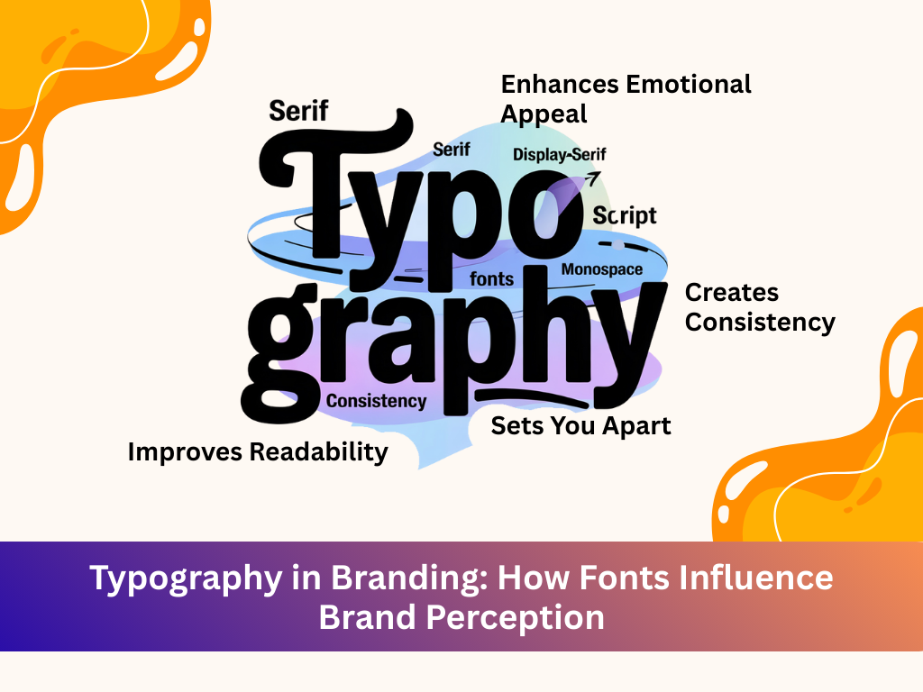
1. Creates Consistency
Using a consistent typography system across platforms builds brand recognition and a cohesive identity.
2. Enhances Emotional Appeal
Typography can make your brand feel friendly, elegant, powerful, or relaxed—setting the emotional tone of your message.
3. Improves Readability
Good font selection supports readability, especially on digital interfaces. This improves the user experience and keeps visitors engaged.
4. Sets You Apart
Custom typography or carefully chosen fonts can help your brand stand out and be instantly recognizable.
How to Choose the Right Typeface for Your Brand
- Define Your Brand Personality: Is your brand playful or professional? Bold or understated? Choose fonts that reflect these traits.
- Think About Your Audience: What will resonate with them? A corporate font may not work for a Gen Z-focused brand.
- Test for Legibility: Fancy fonts may look cool but if they’re hard to read—especially in smaller sizes—they can hurt your brand.
- Use a Font Hierarchy: Pair 2–3 fonts with clear roles (headline, subheading, body text) to create visual interest and guide readers through your content.
- Ensure Scalability: Your fonts should look good on every screen size, from mobile to desktop to print.
- Avoid Trends Without Strategy: Trendy fonts may become outdated. Choose timeless styles that match your long-term brand goals.
Examples of Brands with Iconic Typography
- Coca-Cola: Script font reflects tradition and emotional warmth.
- Google: Clean sans-serif for a modern and friendly vibe.
- Vogue: Classic serif to convey elegance and sophistication.
- Netflix: Bold custom type for a strong and confident presence.
- Mailchimp: Quirky typography to match its playful tone.
Typography isn’t just a design choice—it’s a branding decision. Fonts speak volumes about who you are and what you stand for.
Whether you’re creating a new brand or refreshing an old one, the fonts you choose can build connection, trust, and loyalty—without saying a word.
Need help refining your visual identity?
At Brandifyy, we help businesses choose the right typography, design systems, and brand voice that resonate with their audience and set them apart from the competition.
Let your fonts do the talking—and make sure they say the right thing.